Gillette Germany
Razor
PDP
Redesign
Increasing customer retention on Gillette.de by redesigning the razor product detail page and articles experience for the German market.

Gillette Germany
Increasing customer retention on Gillette.de by redesigning the razor product detail page and articles experience for the German market.
Heuristic Evaluation
Visibility of System Status
No cart confirmation feedback
Adding a product showed no visual response — users couldn't tell if the action worked.
Match System & Real World
Technical jargon, no plain-language benefits
"FlexBall technology" appeared with no explanation of what it means for the user's shave.
User Control & Freedom
No in-page model comparison
Comparing Fusion5 vs SkinGuard required leaving the page entirely and relying on memory.
Consistency & Standards
CTA position and labels vary per product
Add to Cart appeared above imagery on some pages, below spec tables on others.
Recognition Over Recall
Blade compatibility invisible on PDP
Users had to navigate away and cross-reference to find compatible refill blades.
Aesthetic & Minimalist Design
Promo banners overwhelm product content
Discount banners competed directly with the product hero, diluting the premium feel.
Flexibility & Efficiency
No subscription option on PDP
The blade refill subscription existed elsewhere but was completely absent from the PDP.
Error Recovery
Out-of-stock handling offers no path forward
Unavailable variants were greyed out with no message, no alternative, no notify option.
Error Prevention
Incompatible blade + handle combo possible
A Mach3 handle and Fusion5 blades could be added to cart together with no warning.
Help & Documentation
No FAQ or support on PDP
Help required navigating to the footer — breaking the user's purchase flow entirely.
Visibility of System Status
No breadcrumb navigation
Users landing from search had no sense of where they were within the site.
Aesthetic & Minimalist Design
Reviews buried below the fold
Social proof only appeared after spec tables — invisible to most users at the CTA.
Articles Page
The editorial content page had no mechanism to bring users back or guide them toward re-purchase — a key gap in the retention loop.
Competitive Analysis
We benchmarked Gillette DE against 3 competitors across 8 UX dimensions — revealing clear gaps the redesign needed to close.
| Gillette DESUBJECT | Harry'sDTC CHALLENGER | WilkinsonEU LEGACY | Braun DEP&G SIBLING | |
|---|---|---|---|---|
| Product Layout | ■■□□□ Inconsistent CTA placement; no clear visual hierarchy between product variants. Critical Gap | ■■■■□ Clean single-column layout, prominent CTA with sticky behaviour on scroll. Best in Class | ■■■□□ Functional but cluttered; promo banners compete with product hero imagery. Gap | ■■■■□ Strong visual hierarchy; consistent CTA position across all product pages. Best in Class |
| Subscription & Retention | ■□□□□ Subscription option exists on site but is entirely absent from the PDP. Critical Gap | ■■■■■ Subscription is the default selection; prominently surfaced with savings callout. Best in Class | ■■□□□ Available but not prominent — buried in footer or separate subscription page. Gap | ■■□□□ Subscription available but not integrated into PDP flow. Gap |
| Social Proof | ■■□□□ Reviews present but below the fold — invisible to most users at point of CTA. Critical Gap | ■■■■□ Star rating shown near product title; review count prominent above the fold. Best in Class | ■■■□□ Rating shown near title but review depth is limited. Gap | ■■■□□ Ratings visible near CTA but review count is minimal. Gap |
| Navigation & Findability | ■■□□□ No breadcrumbs; users landing from search have no contextual wayfinding. Critical Gap | ■■■□□ Minimal navigation but clean — relies on product as standalone destination. Gap | ■■■■□ Clear breadcrumbs and category navigation across all PDPs. Best in Class | ■■■■□ Strong breadcrumb system; product family navigation clearly labelled. Best in Class |
| Help & Support | ■□□□□ No FAQ on PDP. Help requires navigating to footer — breaks purchase flow. Critical Gap | ■■■□□ FAQ section on PDP addresses common blade/skin-type questions inline. Gap | ■■□□□ FAQ available but linked, not embedded — still requires context switching. Gap | ■■■□□ In-page FAQ for product compatibility; chatbot accessible from PDP. Gap |
What Was Built
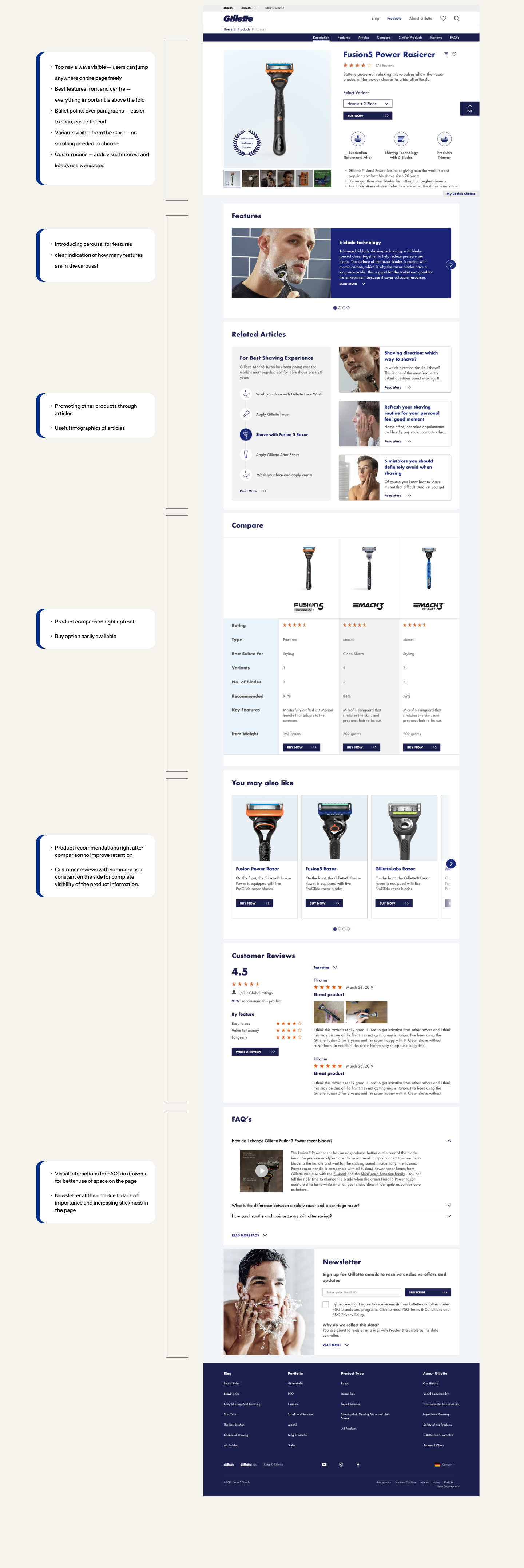
Final Prototype
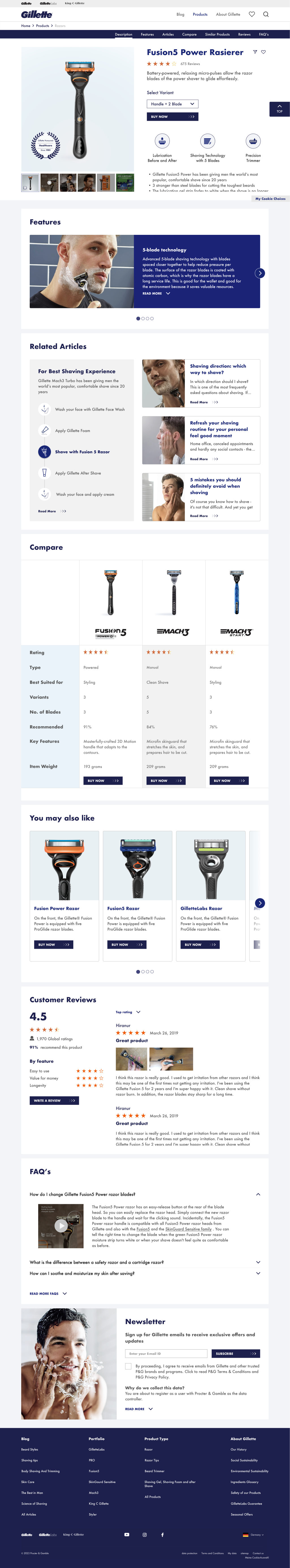
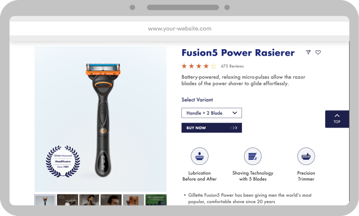
Product Detail Page
Articles Page